- Charlie Mitchell on the IDI. I note that we still need something like an IPUMS front-end to enable greater confidentialised access. I also wish that IDI weren't an afterthought for the government. I'm still annoyed that they wasted time and money on a completely pointless Indicators Aotearoa New Zealand project rather than fixing up systems that should be considered core. Even Infoshare fell over for a few hours yesterday.
- A chat with Sean Plunkett on student loans, student cost of living, and the case for charging interest on student loans.
- Talked with the Environment Committee about the Emissions Reduction Plan - about 20 minute in on this video. I'd thought I'd seen Brent Edwards in the room. My submission is here.
- Chatted with Jenée Tibshraeny about government debt.
- Anne Gibson noted my submission on building materials supply in her piece in the leadup to yesterday's release of the ComCom draft report. I really liked the report - at least on a quick look through. It hits very well, in detail, on the horrible regulatory and consenting mess facing anyone considering using unfamiliar materials.
- Had a chat with Hosking about the unemployment numbers, in advance of their release. I don't do unemployment figure forecasting though.

Showing posts with label unemployment. Show all posts
Showing posts with label unemployment. Show all posts
Friday, 5 August 2022
Around the traps
A few bits from me in these:


Friday, 29 July 2022
Making work
The wage subsidy scheme in 2020 made a lot of sense. It kept workers attached to firms through lockdown, so everything could restart quickly in May.
When we'd talked with officials about it around that time, we'd noted that while it seemed great as temporary response to lockdown, it shouldn't be extended to prop up tourism/hospitality over the longer term. The sector would have to adjust, and propping-up would otherwise create zombies.
RNZ reported this week on the Jobs for Nature programme still being used to prop up tourism firms in South Westland.
South Westland businesses involved in a Jobs for Nature programme where the government pays their staff to work on conservation projects, are determined to find a way to keep it going after the funding runs out. As well as helping to keep the businesses afloat during the Covid disruptions, more than 70,000 hours have been spent trapping, weeding, maintaining tracks - and even finding an endangered bat species. The government has committed $3.78 million to the scheme and that'll end in June next year. At a recent hui at Fox Glacier many of the more than forty business who've signed up for the progamme agreed that it's done much more than simply keeping them afloat until tourism in the region rallies. Kathryn speaks with Rob Stewart from Skydive Skydive Franz Josef and Fox Glacier, Dale Burrows from Franz Josef Wilderness Tours and Wayne Costello from DoC.
You can listen to the whole interview to hear Kathryn Ryan very impressed by the government's helping to keep these companies afloat. I'm sure Nine-to-Noon has run interviews with employers unable to find staff. I find it weird that nobody connects these things.
If unemployment were really high, maybe the case would be different.
But the effect of the programme currently is to prop up firms that are no longer viable and that cannot attract capital or credit to tide them through until tourism numbers might increase again while putting scarce workers onto Jobs for Nature projects.
Those projects may well deliver environmental benefits. But if any cost-benefit assessment was ever done on those, and I'm not sure any were, it would have been in the context of labour being in surplus, rather than desperately scarce. Nobody thought this was a good idea before the pandemic brought expectations of high unemployment, right?
Running job creation schemes, at current unemployment rates, and at current measures of the output gap, is a mistake.
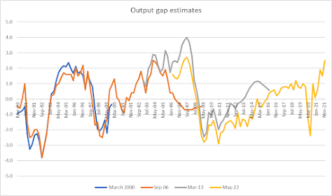
I was curious what the output gap from the latest Monetary Policy Statement looked like in historical context so I threw this together to get a longer time series. Each line is the output gap provided by a different MPS. In some cases, the MPS provides a forecast, so neat to see how the measure panned out relative to the forecast. In other cases, revisions to GDP or to the output gap forecasting measure makes for differences between the lines.
Current levels of the output gap aren't unprecedented. And gaps on the lower side are worth avoiding. But it certainly doesn't look like a time for running make-work schemes.
Monday, 12 July 2021
Afternoon roundup
The browser tabs...
- The Internet Archive will help improve access to a lot of books currently held by the National Library. Naturally, this upsets some people.
- Mike Joy wins a battle over what "natural levels" of nitrate in aquifers might mean.
- Places where the local schools are funded by higher levels of government wind up trying to privatize the public schools through zoning. Everything's tradeoffs though, eh? If schools are funded by the local communities, poor places get really bad schools. It's instead a good argument against even greater anti-NIMBY vigilance.
- Potential nudges to improve compliance with scanning-in for Covid tracing. I'd add one more: put the QR codes in lots of places. Make it easy. At the entrance is great, but if your phone isn't ready and you'd be holding up a queue, maybe you won't scan and you'll forget to on the way out. Put them everywhere.
- The EMA makes a very bad argument about unemployment rates. The point of inflation targeting and increasing rates when you're hitting capacity constraints isn't to create some stupid Marxist reserve army of unemployed, which seems to be what they're arguing for. The point instead is that if a monetary push gets you past NAIRU, you just wind up back at higher unemployment rates anyway once contracts adjust AND you have higher inflation to go with it. Anyway, because either EMA put it badly or it was reported badly, a billion tweets followed claiming the Marxists were right all along.
- Heather du Plessis-Allan cites me here on Treasury's diminished capabilities. Worth noting: all of that was prior to the current Secretary's appointment. She may well have improved things since; I need to get OIAs in to check.
- Shipping is a mess.
- Remember back at the Budget Economic and Fiscal Update when Treasury put in a footnote saying they couldn't produce a structural deficit figure this time round because they couldn't tell how to place some of the Covid-spend? And it seemed odd because Covid-spend is supposed to be emergency = one-off = not-structural? Well, looks like the free school lunch programme is Covid spend. I simply do not understand how this works. Shouldn't the Auditor General be going after this kind of thing as misappropriation?
- The government isn't bothering to check on whether people got their Covid tests before travelling. Some of them get caught ex-post, with the option to go into quarantine or return to Oz, after they've been circulating in New Zealand already. If they went back to Oz and turned up positive, what hope would we have on contact tracing them? However low your expectations of government competence are, you just keep being surprised.
Monday, 2 September 2019
Afternoon Roundup
The afternoon's closing of the browser tabs brings:
- Tony Burton at The Spinoff on unemployment figures. Far fewer of those aged 15-19 are in work now than was the case prior to 2008. The jump, to my eye, coincides with Labour's abolition of the differential lower youth minimum wage. There's been of course expansion in tertiary education over the period, but the timing is consistent with the change in the youth minimum wage combined with the GFC, then levelling out to a higher steady-state youth unemployment rate.
- The government isn't just mulling over porn filters. They're also looking at blocking access to online gambling. Another Tracey Martin initiative.
- This older piece at the New York Times uses the Mercatus Center's tallying of regulations to look at the quantum of regulation facing apple growers in the US. It would be pretty interesting to replicate that Mercatus project in New Zealand.
- Andrew Leigh on Australia's second convict age. Incarceration rates have been rising in Oz since the mid-1980s, with rates now again where they were around 1900 (though nowhere near incarceration rates in the US, and still below New Zealand's rates). He cites Kleiman approvingly on the importance of the swiftness and certainty of penalty over the duration of sentence.
Wednesday, 16 January 2019
Afternoon roundup
This afternoon's worthies on closing out the accumulated browser tabs:
- Russell Brown on cannabis reform, including links through to reasonable critiques of the Berenson work that's been floating around.
- Some excellent data work by Mike Reddell looking at the time path of employee compensation in NZ. Labour worries a lot about what they see as a declining labour share of income. Here are the key graphs.
First up, employee compensation as fraction of GDP, adjusted for production taxes and subsidies. It's up on where it was in the 90s, but has been flat for the past decade.
Next up, wages as fraction of nominal GDP per hour worked:
Reddell's summary:There is a fair bit of short-term noise, but the trend is pretty clear. On this data, wages have been rising faster than the overall earnings capacity of the economy. That was so in the 00s, and has been so – albeit to a lesser extent – in recent years too. For anyone inclined to want to debunk the analytical unadjusted series, note that this chart is not wildly inconsistent with the labour share chart I showed earlier: the labour share of total income has increased since the early 00s, with the biggest change occurring in the pre-recession 00s themselves.
The underlying problem remains low productivity growth. - Labour markets remain tight.
- These wonderful maniacs coded folklore from 1,000 pre-industrial societies to look for common traits that could be used in testing social science conjectures. Pastoral oral traditions have more motifs of anger and retaliation; foraging societies have more leisure-related motifs; political centralisation correlates with more use of trade and money words and with respect-related motifs. And old folklore predicts current views about things like toleration of socially deviant behaviour. Read!
- Nudges are far less beneficial when we consider the psychological costs imposed on the nudgees.
- Peer effects matter. Or, an argument against school zoning rules that concentrate disadvantage.
- Requiring a job search period before benefit uptake can be rather beneficial. It increases earnings and reemployment, without worsening health or crime outcomes.
- Informal governance matters in disaster planning. I'm reminded of last year's Christchurch Earthquakes Symposium, where Hurunui District Council's Hamish Dobbie explained [my take on part of his talk] how their Council worked to enable civil society organisations rather than supplant them after the Kaikoura earthquakes.
- And finally, Nate Silver: How my brain interprets every Brexit explainer: https://t.co/7smQVKMP76— Nate Silver (@NateSilver538) January 15, 2019

Wednesday, 8 November 2017
Unemployment targets
Grant Robertson wants the Reserve Bank to follow a dual mandate, targeting both inflation and unemployment.
RBNZ already weighs unemployment, both because inflation targeting requires having a sense of the slack available in the economy, and because policy targets agreements have required that the bank minimise unnecessary variability in the unemployment rate while targeting inflation.
I expect a formal dual mandate is riskier than Rob Hosking at the NBR suggests. A sound governor backed by a good board will recognise that the long-run Philips curve is vertical and seek to minimise longer run unemployment by providing stable inflation rates around the middle of the inflation band. But if a governor and board are chosen explicitly by the Minister to focus on unemployment, that could be decidedly worse. Policy targeting lower unemployment while taking an eye off of inflation will succeed in delivering permanently higher inflation while doing nothing to reduce long-run unemployment.
And where Robertson says he wants unemployment down below 4%, where it was in 2005-2008, we should remember that there are a few ways of doing that. The labour force participation rate in 2005-2008 never reached 78% in the June quarter annual figures (for those aged 15-64, so isolating from changes in retirement behaviour). It has been above 78% since 2014 and sat at 80.4% in the 2017 June annual figure. The employment rate, 2005-2008, was 74.8 in those annual June figures; in 2017's figures, it was 76.2%.
As I read the figures, we've had strong population growth and strong employment growth. Together those mean that a new tranche of workers enter the market, start looking for work, find jobs, and a new tranche of incoming job-seekers follow on behind. At the same time we've had a strong push to get people from benefits into work. All of those have boosted the participation rate and the employment rate - and the churn from new entrants coming in has pushed up the unemployment rate a bit.
Getting the unemployment rate down by a point would be pretty easy: stop work-testing things at MSD, and slow the arrival of new migrants who bring partners who spend a couple quarters looking for work before landing a job. The labour force participation rate would drop, as would the employment rate. But if all you care about's the unemployment rate, that'd do it.
RBNZ already weighs unemployment, both because inflation targeting requires having a sense of the slack available in the economy, and because policy targets agreements have required that the bank minimise unnecessary variability in the unemployment rate while targeting inflation.
I expect a formal dual mandate is riskier than Rob Hosking at the NBR suggests. A sound governor backed by a good board will recognise that the long-run Philips curve is vertical and seek to minimise longer run unemployment by providing stable inflation rates around the middle of the inflation band. But if a governor and board are chosen explicitly by the Minister to focus on unemployment, that could be decidedly worse. Policy targeting lower unemployment while taking an eye off of inflation will succeed in delivering permanently higher inflation while doing nothing to reduce long-run unemployment.
And where Robertson says he wants unemployment down below 4%, where it was in 2005-2008, we should remember that there are a few ways of doing that. The labour force participation rate in 2005-2008 never reached 78% in the June quarter annual figures (for those aged 15-64, so isolating from changes in retirement behaviour). It has been above 78% since 2014 and sat at 80.4% in the 2017 June annual figure. The employment rate, 2005-2008, was 74.8 in those annual June figures; in 2017's figures, it was 76.2%.
As I read the figures, we've had strong population growth and strong employment growth. Together those mean that a new tranche of workers enter the market, start looking for work, find jobs, and a new tranche of incoming job-seekers follow on behind. At the same time we've had a strong push to get people from benefits into work. All of those have boosted the participation rate and the employment rate - and the churn from new entrants coming in has pushed up the unemployment rate a bit.
Getting the unemployment rate down by a point would be pretty easy: stop work-testing things at MSD, and slow the arrival of new migrants who bring partners who spend a couple quarters looking for work before landing a job. The labour force participation rate would drop, as would the employment rate. But if all you care about's the unemployment rate, that'd do it.
Wednesday, 3 May 2017
Smokin'
I just can't get over the employment figures.
Migration is running hot: huge numbers of incoming workers. Incoming workers take time to find work. At the same time, the government's been pushing pretty hard on work-testing for beneficiaries - and that would have people responding to a labour force survey saying that they're looking for work even if they're not looking all that hard.
And yet, and yet... just look at this. Here's Household Labour Force data going back to 1987, annual March figures. I'm using HLF230AA for anyone wanting to check things in Infoshare.
The top green line is the working age population (age 15-64). That's had a reasonable recent rise mostly due to migration. If there were a lump of labour problem, we'd either have an increase in the number reporting not being in the labour force, or reporting being unemployed.
But that sure hasn't happened. Instead, we've had huge employment growth and actual declines in the number of people reporting being unemployed.
Just look at it. In 1995, there were 700,000 fewer working-aged people in New Zealand than there are in 2017. But there are over 5,000 fewer people reporting being unemployed in 2017.
Or compare it to the overheated mid-2000s. When unemployment was at its lowest ebb, in 2008, there were just under 80,000 unemployed people, 624,000 not in the labour force, and a working-age population of just under 2.8 million.
The 2017 figures have just over 280,000 more working-aged people than 2009 but a total labour force that's almost 300,000 people larger: 18,600 fewer people report not being in the labour force. 248,000 more people in employment. There are just under 51,000 more people reporting being unemployed now than there were then, but the labour force participation rate is 2.6 percentage points higher and the employment rate is 1.3 percentage points higher.
The employment rate among people aged 15-64 is 76.1%. There is no year, going back to 1987, that had it that high. The labour force participation rate for that age group is 80.3% - also the highest in the data going back 30 years. Only minor caveat is that hours worked are growing less quickly, although that wouldn't be surprising either if some shifting into the labour force are picking up part-time rather than full-time work.
We should be shouting from the rooftops about how superbly the New Zealand economy has grown to match the growth in those wanting to be employed here. Whatever your concerns about immigration, dey terk yer jerb shouldn't be one of them.
Migration is running hot: huge numbers of incoming workers. Incoming workers take time to find work. At the same time, the government's been pushing pretty hard on work-testing for beneficiaries - and that would have people responding to a labour force survey saying that they're looking for work even if they're not looking all that hard.
And yet, and yet... just look at this. Here's Household Labour Force data going back to 1987, annual March figures. I'm using HLF230AA for anyone wanting to check things in Infoshare.
The top green line is the working age population (age 15-64). That's had a reasonable recent rise mostly due to migration. If there were a lump of labour problem, we'd either have an increase in the number reporting not being in the labour force, or reporting being unemployed.
But that sure hasn't happened. Instead, we've had huge employment growth and actual declines in the number of people reporting being unemployed.
Just look at it. In 1995, there were 700,000 fewer working-aged people in New Zealand than there are in 2017. But there are over 5,000 fewer people reporting being unemployed in 2017.
Or compare it to the overheated mid-2000s. When unemployment was at its lowest ebb, in 2008, there were just under 80,000 unemployed people, 624,000 not in the labour force, and a working-age population of just under 2.8 million.
The 2017 figures have just over 280,000 more working-aged people than 2009 but a total labour force that's almost 300,000 people larger: 18,600 fewer people report not being in the labour force. 248,000 more people in employment. There are just under 51,000 more people reporting being unemployed now than there were then, but the labour force participation rate is 2.6 percentage points higher and the employment rate is 1.3 percentage points higher.
The employment rate among people aged 15-64 is 76.1%. There is no year, going back to 1987, that had it that high. The labour force participation rate for that age group is 80.3% - also the highest in the data going back 30 years. Only minor caveat is that hours worked are growing less quickly, although that wouldn't be surprising either if some shifting into the labour force are picking up part-time rather than full-time work.
We should be shouting from the rooftops about how superbly the New Zealand economy has grown to match the growth in those wanting to be employed here. Whatever your concerns about immigration, dey terk yer jerb shouldn't be one of them.
Thursday, 3 November 2016
Simpsons' paradoxes and GDP per hour worked
Bernard Hickey's been on a bit of a tear about GDP per hour worked and employment rates.

And, one more:

So NZ created 179k jobs in the last 2 yrs, but unemployment actually rose 1k to 128k. Jobs soaked up by net migration & more >65 yrs working— Bernard Hickey (@bernardchickey) November 2, 2016
There's another potentially relevant chart.NZ actually worse since 2012. Flat real gdp per hour worked. We're just pumping more low wage workers in the economy and working more hours. pic.twitter.com/9uKE0UV1vR— Bernard Hickey (@bernardchickey) November 2, 2016
And, one more:

I wonder what GDP per hour worked would look like if we could isolate out demographic changes.
At the same time as the recent flatlining in GDP per hour worked, we've had substantial numbers of beneficiaries moving out of benefit and into work. The first of my charts has number of people on benefit over the period. The proportion of working-age people on benefits was 12.1% in 2011. It is now 9.8%. Average productivity among those moving off of benefits will likely be rather lower than average productivity among other workers. But while that would worsen average productivity or GDP per hour worked, it won't worsen anyone else's productivity unless they're making other workers less productive just by being there.
The second of my charts has employment rates sorted by age cohort. Recall that the employment rate is the number of employed people divided by the population in that cohort - it isn't the inverse of the unemployment rate. You can have rising employment rates and rising unemployment rates if people are being drawn into the labour force who were previously not seeking work.
I've dropped out prime age workers, which have been much flatter, so you can see the compositional changes in the tails. The youngest workers are least productive. They hugely dropped out of the labour market with the changes to the youth minimum wage, but that decline's since reversed a bit. There's been a long trend growth in hours worked among older workers, but typical wage patterns over the lifecycle have wages flattening out from the early 50s or thereabouts. Big increases in employment rates among cohorts with lower than average productivity, or at points in the life cycle where wage profiles (and presumably productivity) flatten out, will both flatten or worsen GDP per hour worked.
And, obviously, net migration's increased over the last few years. New workers getting settled in New Zealand might take a bit to find their feet as well, while still being better off than they were before.
The classic Simpson's Paradox shows how you can have a declining average measure for a group despite improving average measures for each cohort within the group if changes in the proportions of the overall group coming from the different cohorts change.
So suppose that you have a classroom with 5 Canadians and 10 Kiwis. The Canadians all get 70% on their tests this year and the Kiwis all get 90%. Average is 83%. Next year, there are 10 Canadians and 5 Kiwis. The Canadians all get 75% and the Kiwis all get 95%. The group average drops to 82%. Every cohort has improved by five points, but the average performance looks bad.
And so I wonder what the GDP per hour worked figures would look like isolating for these compositional changes.
Note too the strength of the employment rate. Only four years in the series back to '86 had higher employment rates: 2005-2008.
Monday, 20 June 2016
90 Days
Motu's had a look at the effects of the 90 day trial legislation. Under that legislation, employers could hire employees on a trial basis and dismiss them relatively easily within that 90 day window. Supporters of it expected it to encourage employment of riskier employees; opponents expected substantial churn: that employers would somehow figure it made sense to hire people for three months, fire, rinse and repeat.
The Motu study, undertaken by Nathan Chappell and Isabella Sin, two fine Canterbury economics graduates, uses a beautiful little natural experiment. Firms smaller than 20 employees were allowed to use the provision; those over it were not. At least for a time. Afterwards, it extended. But you had a nice little period in which there was a discontinuity at 20 employees. They then looked at hiring data in for firms in the 15-25 employee range. If the bill had effects, that's where the difference would show up.
Using that experiment they find, well, very little in the aggregate. There was no particular boost to employment, but neither was there any churn. It didn't seem to do anything at all.
But there is a bit of a problem in focusing on the aggregate. If you're looking at effects across all firms, and only a minority of firms would ever want to use the trial periods, then if there were an effect for that group of firms, you likely wouldn't see it in the aggregate data. The data doesn't let them tell which firms actually elected to hire new employees on trial arrangements, and which offered permanent contracts from the get-go.
Or to put it another way, suppose that some medicine reduced your chance of death from a relatively uncommon disease by 10%. You wouldn't notice any effect at all in overall aggregate national death rates. But you would notice it if you looked in the places where it were used.
This could matter. They cite MBIE work showing greater uptake of trial periods in construction and wholesale trades and low use in education and training; they then find a about a 10% increase in hires among small firms in industries known to use trial periods who were eligible to use trial periods as compared to small firms in the same industry that were just a bit too big to use trial periods. Those small firms eligible for 90-day trial periods in high-use industries had about a 7% increase in long-term hires.
Evidence that it particularly encouraged employment of riskier employees is rather weak, or at least riskier as measured by things like being a former beneficiary.
On the whole, it looks like the policy provided an increase in employment in construction companies and wholesale trades, no increase in churn or dismissals. If you think that people bear substantial psychological costs of a 90-day trial period where actual dismissal rates are trivial, then you might not like the policy. If you think that those are likely to be minor relative to the employment benefits in the sectors that need it, then the policy remains a good one. And if you're going to weigh the psychological costs of uncertainty for employees under trial periods, weigh too the psychological costs for employers having to make hires under conditions where firing is very difficult.
It might not be as beneficial as we had hoped at the outset, and so it might have been a mistake when evaluated against other beneficial policies on which the government could have expended political capital (youth minimum wages, for example), but it's a policy well worth continuing.
Thursday, 29 January 2015
Zero-hour
The Labour Party's come out against zero-hour contracts: an employment practice where employees have to be on call for what shifts might come, but with no particular guarantees of how many hours might come or when those hours may be required.
Jim Rose discusses things in a four-post series, which takes a more academic take on the question.
Here, Jim argues that a good start would be reckoning why employers and employees would agree to the deal in the first place. Unless labour markets are highly uncompetitive with employers having massive power over employees, employers should have to pay a per-hour premium if zero-hour contracts are a hassle for workers. If we see zero-hour contracts in Christchurch, for example, I don't think we can first-cut look to power as the answer: plenty of labour demand there.
In the second part, Jim notes that the fixed costs of employment are such that you shouldn't expect zero-hour contracts: you'll typically do better with one 40-hour worker over two 20-hour workers barring some kind of mandatory benefit for 40-hour workers. I don't think there's any set benefits threshold that obtains for 0-hour contract workers as compared to 20-hour workers though. Each additional employee means recruitment, overhead, HR and training costs; why pay all that out on somebody who might only work 3 hours a week?
You might do it if there are strong and somewhat unpredictable fluctuations in product demand. Jim notes premiums for part time jobs in seasonal industries; I'd also expect some of those employers could also see advantages of zero-hour contracts. If it's raining, you're less likely to send a team of fruit-pickers out; when it's sunny, you need all hands on deck. Jim expects, rightly I think, that zero hour contracts would be most likely in jobs with low recruitment costs and where specialised training needs are low. While you might think that could point to potential power issues, think twice: specialised skills can be more likely to make you beholden to particular employers.
In part 3, Jim expects workers with low fixed costs of working will flip into the zero-hour sector while those with higher fixed costs would prefer lower hourly rates but more guaranteed hours. Again, read "lower" here as meaning "relative to what they could elsewhere earn".
Finally, Jim relates all this back to problems of team production.
Jim makes one big and important point in all this: unless we have a good idea about why firms are moving to this contract structure, and why employees are sticking with it rather than flipping instead to other employers, meddling in the arrangements via policy is pretty risky.
Jim Rose discusses things in a four-post series, which takes a more academic take on the question.
Here, Jim argues that a good start would be reckoning why employers and employees would agree to the deal in the first place. Unless labour markets are highly uncompetitive with employers having massive power over employees, employers should have to pay a per-hour premium if zero-hour contracts are a hassle for workers. If we see zero-hour contracts in Christchurch, for example, I don't think we can first-cut look to power as the answer: plenty of labour demand there.
In the second part, Jim notes that the fixed costs of employment are such that you shouldn't expect zero-hour contracts: you'll typically do better with one 40-hour worker over two 20-hour workers barring some kind of mandatory benefit for 40-hour workers. I don't think there's any set benefits threshold that obtains for 0-hour contract workers as compared to 20-hour workers though. Each additional employee means recruitment, overhead, HR and training costs; why pay all that out on somebody who might only work 3 hours a week?
You might do it if there are strong and somewhat unpredictable fluctuations in product demand. Jim notes premiums for part time jobs in seasonal industries; I'd also expect some of those employers could also see advantages of zero-hour contracts. If it's raining, you're less likely to send a team of fruit-pickers out; when it's sunny, you need all hands on deck. Jim expects, rightly I think, that zero hour contracts would be most likely in jobs with low recruitment costs and where specialised training needs are low. While you might think that could point to potential power issues, think twice: specialised skills can be more likely to make you beholden to particular employers.
In part 3, Jim expects workers with low fixed costs of working will flip into the zero-hour sector while those with higher fixed costs would prefer lower hourly rates but more guaranteed hours. Again, read "lower" here as meaning "relative to what they could elsewhere earn".
Finally, Jim relates all this back to problems of team production.
Jim makes one big and important point in all this: unless we have a good idea about why firms are moving to this contract structure, and why employees are sticking with it rather than flipping instead to other employers, meddling in the arrangements via policy is pretty risky.
Thursday, 7 February 2013
Nominal and real
Stats New Zealand reports wage growth over the last year. It's not great in nominal terms, as the Press points out:
Year-on-year CPI inflation in the September quarter was 0.8%; December quarter was 0.9%. It's not been that low since December 1999. If we look at series SW512Q, which tallies mean percentage increase from previous quarter among those receiving a pay increase (presumably the one cited in the Press, above), we find that the median increase from December quarter 2003 through December quarter 2012 was 3.9%. If we look at CPI over the same time period, the median was 2.6%. I'd be happier getting a 3% nominal increase when the CPI is 0.9% than getting a nominal 3.9% increase when the CPI is 2.6%. And, the mean increase from the same quarter of the previous year (SW512A) is 3.7% (median increase against same quarter of the previous year is 3.0%).
If you net inflation out of wage growth, the last quarter is about double the median since December 2003 (note that the easy-to-get Stats series here starts December 2003).
Aha, that only counts increases among those getting an increase. What about the people who didn't get an increase?
Actually, things are looking pretty good there - and surprisingly so given the below-the-lower-bound current inflation outcomes. Over the whole of 2012, 43.75% of workers reported zero wage increase. From 2003 to December quarter 2008, the average quarter saw 41.3% of workers reporting zero wage increase. If our current low inflation rates were causing serious problems given nominal wage rigidity, I for one would be expected a heck of a lot more bunching around the zero increase threshold. Instead, this year's figures are about where they were in 2004.
I've put things into a Google Spreadsheet. The original LCI data is here.
The blue line traces nominal median wage increases, year on same quarter prior year, going back as far as the easy-to-get series goes. The red line traces CPI inflation. Note that I netted the GST increase out of those figures for December 2010-September 2011 as those were fully compensated by income tax cuts. The yellow line is simply the nominal wage increase less CPI.
Here is the percentage of workers receiving a wage increase over the same quarter in the prior year. So if you were making more this year than the same time last year, you show up as a 1 in this series, otherwise a zero. If low inflation combined with nominal wage rigidity causes problems, I'd have expected a sharper increase in the proportion of workers receiving no pay increase, although you could tell a story around low inflation and nominal wage rigidity where employers cut on the extensive margin while compensating on the intensive margin (cut some workers but pay remaining workers more).
The unemployment numbers come out later this week.
But hold on a minute..For those who actually got a pay rise, the mean increase for all surveyed salary and wage rates that rose in the December 2012 quarter was 3.0 per cent, compared with 3.1 percent in the September 2012 quarter.The latest mean increase is the lowest since a 3.0 per cent increase in the September 2000 quarter. Of all pay rates surveyed, 55 per cent showed annual increases in the year to December 31.
Year-on-year CPI inflation in the September quarter was 0.8%; December quarter was 0.9%. It's not been that low since December 1999. If we look at series SW512Q, which tallies mean percentage increase from previous quarter among those receiving a pay increase (presumably the one cited in the Press, above), we find that the median increase from December quarter 2003 through December quarter 2012 was 3.9%. If we look at CPI over the same time period, the median was 2.6%. I'd be happier getting a 3% nominal increase when the CPI is 0.9% than getting a nominal 3.9% increase when the CPI is 2.6%. And, the mean increase from the same quarter of the previous year (SW512A) is 3.7% (median increase against same quarter of the previous year is 3.0%).
If you net inflation out of wage growth, the last quarter is about double the median since December 2003 (note that the easy-to-get Stats series here starts December 2003).
Aha, that only counts increases among those getting an increase. What about the people who didn't get an increase?
Actually, things are looking pretty good there - and surprisingly so given the below-the-lower-bound current inflation outcomes. Over the whole of 2012, 43.75% of workers reported zero wage increase. From 2003 to December quarter 2008, the average quarter saw 41.3% of workers reporting zero wage increase. If our current low inflation rates were causing serious problems given nominal wage rigidity, I for one would be expected a heck of a lot more bunching around the zero increase threshold. Instead, this year's figures are about where they were in 2004.
I've put things into a Google Spreadsheet. The original LCI data is here.
The blue line traces nominal median wage increases, year on same quarter prior year, going back as far as the easy-to-get series goes. The red line traces CPI inflation. Note that I netted the GST increase out of those figures for December 2010-September 2011 as those were fully compensated by income tax cuts. The yellow line is simply the nominal wage increase less CPI.
Here is the percentage of workers receiving a wage increase over the same quarter in the prior year. So if you were making more this year than the same time last year, you show up as a 1 in this series, otherwise a zero. If low inflation combined with nominal wage rigidity causes problems, I'd have expected a sharper increase in the proportion of workers receiving no pay increase, although you could tell a story around low inflation and nominal wage rigidity where employers cut on the extensive margin while compensating on the intensive margin (cut some workers but pay remaining workers more).
The unemployment numbers come out later this week.
Tuesday, 29 May 2012
Unemployment lenses: Salmond edition
Rob Salmond thinks NZ Prime Minister John Key is playing silly buggers with employment stats. Salmond puts up a graph showing unemployment rates since 2000; it's higher now than it's been since 2000. He's then less than impressed with Key looking instead to numbers of people in employment:
growth.* All of my charts are drawn from the Stats NZ HLF series "Total Labour Force Status by Sex by Age Group (Annual-Dec)"**, taking the total for both sexes over all ages [nothing much changes in restricting things to a 20-59 age cohort if you prefer that].
 There's a decline in total employment from '87 through '92, a nice rise from '93-'96, a levelling off from '97-'99, then the rise Salmond shows from 2000 through the most recent recession. Note that the y-axis cuts at 1200; this makes dips and rises seem larger than they really are [Salmond's has a similar cut].
But, as Salmond rightly says, total employment really isn't a great measure without some correction for population; we really need to look at the employment rate. So, how's the employment rate doing? Here's the graph:
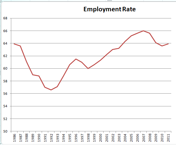
When I look at that chart, I see an abnormal bulge starting around 2005 - about the period when RBNZ let inflation get a bit out of hand - then levelling down to more more normal ranges. The employment rate isn't higher than it's ever been, but neither is it completely out of whack relative to the full Stats NZ time series or relative to the drop in the employment rate in prior recessions.
And, the unemployment rate isn't as bad as Salmond suggests. Let's start by going back to the start of the data series in 1986 instead of cutting it at 2000.
 Put in a bit of a broader historical context, it's not bad. I'd expect that Salmond was cutting things at 2000 to get a rough decade period, but the impression left by the time series sure changes depending on our choice of start date. And, when we remember that the period from 2008 onwards has been rather worse for the global economy than any period since '86, and that the 2002-2007 period was part of a global boom, we might well be reasonably pleased at current outcomes; it's far worse elsewhere. HLFS data has a nice way of showing what lenses folks are using.
Update: Rob Hosking at NBR agrees and adds that, with employment rates this high and wage growth picking up, there's less room for non-inflationary growth. It's also worth remembering that our employment rates stay high and our unemployment rates stay low in part because of the big labour sink across the ditch: it's easy for our unemployed to move to Oz, and it's not always easy to draw them back when things here pick up. But the iPredict markets don't see inflation anywhere on the horizon.
* Update: dumb typo. Of course population growth rates vary. But population always grows. So absolute drops in numbers employed can't be due to drops in population. Last line and link added in too as I realised I'd forgotten to add it and that the post title made no sense without it. Oops. It's also worth remembering that Key talked about numbers employed at least in part because Shearer kept talking about the increase in the number of people unemployed over the last 4 years. Check the links to Hansard in Salmond's post.
** I'm not sure if the Table Builder link will keep working or whether it's using a session ID. I'm using the annual series to get a cleaner x-axis.
Both in question time and the budget debate last week, [Key] trumpeted National’s incredible jobs achievement:
“… New Zealand now has more jobs that it has ever had in the history of this country. I do not call that failure.” Taddah!
Um, John, more people have jobs now because New Zealand has more people now. It has very little to do with you. Unless, of course, you are about to start taking credit for breeding...
As the chart shows, the number of people in work rises pretty much every quarter, unless there is a large-scale problem like a Global Financial Crisis. More people, more jobs.

The unemployment rate is a much better indicator of government economic management than is the raw number of jobs around.It's a bit odd that Salmond cuts his data series at 2000; most Stats NZ series go back to 1986. If we extend the data series showing number of persons employed back to 1986, we see a few declines in numbers employed despite there being no drop in year-on-year population
Then again, what if we did adopt John Key’s “more jobs than ever before” standard for judging government economic success? How would the last two governments perform on that score?

But, as Salmond rightly says, total employment really isn't a great measure without some correction for population; we really need to look at the employment rate. So, how's the employment rate doing? Here's the graph:

When I look at that chart, I see an abnormal bulge starting around 2005 - about the period when RBNZ let inflation get a bit out of hand - then levelling down to more more normal ranges. The employment rate isn't higher than it's ever been, but neither is it completely out of whack relative to the full Stats NZ time series or relative to the drop in the employment rate in prior recessions.
And, the unemployment rate isn't as bad as Salmond suggests. Let's start by going back to the start of the data series in 1986 instead of cutting it at 2000.

Update: Rob Hosking at NBR agrees and adds that, with employment rates this high and wage growth picking up, there's less room for non-inflationary growth. It's also worth remembering that our employment rates stay high and our unemployment rates stay low in part because of the big labour sink across the ditch: it's easy for our unemployed to move to Oz, and it's not always easy to draw them back when things here pick up. But the iPredict markets don't see inflation anywhere on the horizon.
* Update: dumb typo. Of course population growth rates vary. But population always grows. So absolute drops in numbers employed can't be due to drops in population. Last line and link added in too as I realised I'd forgotten to add it and that the post title made no sense without it. Oops. It's also worth remembering that Key talked about numbers employed at least in part because Shearer kept talking about the increase in the number of people unemployed over the last 4 years. Check the links to Hansard in Salmond's post.
** I'm not sure if the Table Builder link will keep working or whether it's using a session ID. I'm using the annual series to get a cleaner x-axis.
Thursday, 3 May 2012
Unemployment lenses
It's been fun watching the Twitter reactions to the latest quarterly employment survey.
Folks who don't like the government have been pointing to the higher-than-expected unemployment rate. In the last budget, Treasury figured we'd now be at a 5.7% unemployment rate; we're instead at 6.7%. That's a pretty big difference. And, it's a big jump on last quarter's 6.4%, though about on par with where we've been over the last two years.
But Treasury didn't just forecast the unemployment rate in the PREFU.
So 29,000 people are in the labour force who weren't expected to be there. Most of them are unemployed. To me, that says job creation is slow and employers are reluctant to take on available workers, but that people are expecting to be able to find work - otherwise, they'd be outside of the labour force. A really bad news story would have had the number of unemployed higher than expected but with flat or decreasing labour force participation as discouraged workers leave the labour force.
So if you want to paint a good-news story, you can focus on that 5,000 more people are working than Treasury expected and that more people are now working than ever have been before. And, the employment rate, at 64.2%, is higher than it's been since 2009. If you want a bad news story, both unemployment and underemployment remain stubbornly high and hours worked are weak.
Matt Nolan over at TVHE watches these numbers a lot more closely than I do. He points to a fair bit of weakness in total hours worked; he wonders whether an interest rate cut might be in order. iPredict agrees: the likelihood of an interest rate cut in 2012 jumped from 38% to 47% with the employment numbers. Inflation trading suggests inflation rates below 2% through June 2013. After that, there's even odds that it's higher than 2% and a 20% chance that it's over 3%. The markets also suggest the unemployment rate won't fall below 6.5% before September quarter and will stay above 6% until March 2013. I'm not sure the inflation forecasts would be inconsistent with RBNZ trying a small OCR cut.
Folks who don't like the government have been pointing to the higher-than-expected unemployment rate. In the last budget, Treasury figured we'd now be at a 5.7% unemployment rate; we're instead at 6.7%. That's a pretty big difference. And, it's a big jump on last quarter's 6.4%, though about on par with where we've been over the last two years.
But Treasury didn't just forecast the unemployment rate in the PREFU.
| Treasury forecast (,000s) | Actual (,000s) | |
| Not in the Labour Force | 1,115 | 1,086 |
| Labour Force | 2,360 | 2,390 |
| Total Employment | 2,225 | 2,230 |
| Unemployed | 135 | 160 |
So 29,000 people are in the labour force who weren't expected to be there. Most of them are unemployed. To me, that says job creation is slow and employers are reluctant to take on available workers, but that people are expecting to be able to find work - otherwise, they'd be outside of the labour force. A really bad news story would have had the number of unemployed higher than expected but with flat or decreasing labour force participation as discouraged workers leave the labour force.
So if you want to paint a good-news story, you can focus on that 5,000 more people are working than Treasury expected and that more people are now working than ever have been before. And, the employment rate, at 64.2%, is higher than it's been since 2009. If you want a bad news story, both unemployment and underemployment remain stubbornly high and hours worked are weak.
Matt Nolan over at TVHE watches these numbers a lot more closely than I do. He points to a fair bit of weakness in total hours worked; he wonders whether an interest rate cut might be in order. iPredict agrees: the likelihood of an interest rate cut in 2012 jumped from 38% to 47% with the employment numbers. Inflation trading suggests inflation rates below 2% through June 2013. After that, there's even odds that it's higher than 2% and a 20% chance that it's over 3%. The markets also suggest the unemployment rate won't fall below 6.5% before September quarter and will stay above 6% until March 2013. I'm not sure the inflation forecasts would be inconsistent with RBNZ trying a small OCR cut.
Wednesday, 11 April 2012
Parental leave and benefits
Put yourself in the place of an employer faced with two excellent and similarly qualified candidates for a position. You'd be very happy with either. But one, a young women, comes with maternity leave risk. If she decides to have a child, you will bear costs of worsening productivity over the course of the pregnancy despite her best efforts, costs of finding a temp worker to cover her position while she is on maternity leave, and the uncertainty of whether she will indeed return when leave concludes. She may also wish to move to flexible time arrangements on return. The other, male, doesn't. You're running a small business where losing a skilled worker for a short period is a very real burden, even if somebody else is paying her salary while she's on the government's paid parental leave scheme. Whom do you choose?
Cactus Kate makes the case:
New Zealand currently requires employers to hold a woman's position open for a year if she takes maternity; the government provides paid leave scaled to the woman's salary (and subject to a relatively low cap) for 14 weeks. The Labour Party proposes extending this to 26 weeks; the bill has been drawn from the ballot. It is likely to pass first reading, but likely to be killed afterwards because of the budgetary implications.
Were it implemented, I'd expect that the policy will increase the amount of time that women spend on maternity leave. In Canada, Baker and Milligan found that a doubling of the compensated maternity leave entitlement significantly increased the amount of time women spent on maternity leave.* Employers will bear costs despite that the paid leave entitlement is covered by IRD: it will be harder for employers to cover leave internally and so more of them will have to find replacements willing to work on temporary contracts. A longer time outside of the workplace means skills have longer to erode. Women are also more likely to want to return on part-time or flex-time arrangements after longer periods outside of the workforce; Schott finds that the American Family and Medical Leave Act increased women's likelihood of returning to work part-time rather than full-time.** Finally, we may expect increased labour market participation among women anticipating maternity leave, but also increased employer reluctance to take on women of higher maternity risk except at lower wages. But, I don't have a great sense of the incremental cost above existing leave entitlements; what's true at the margin might not cash out as much in the aggregate.
If Labour's economics were just a bit stronger, they'd be trying to couple their policy with some kind of compensation mechanism for employers whose workers take maternity leave rather than embedding the lump of labour fallacy into the bill's explanatory note:
* While the Canadian change increased breastfeeding rates, one of the NZ bill's other stated purposes, it had no effect on child health outcomes.
** While Schott finds increased workplace flexibility encourages post-natal female employment, we might reasonably worry that increased likelihood of moving to part-time or flex-time arrangements reduces an employer's willingness to invest in an employee's human capital or to take on the worker in the first place except at lower wages.
Note: updated a couple of times for clarity and to add links to a couple of helpful tweets from Kevin Milligan and Frances Woolley.
Update 2: @askessler recommends this IZA piece showing no long term benefits to kids from paid maternity leave extensions in Germany.
We can wish that employers would willingly take on these costs. And many who do find that they wind up with a very loyal and committed employee if they do. But it is a risk. And it's a risk that, at least in data from a very nicely designed field experiment in France, has employers shy away from employing women with high maternity risk. Lower employment isn't the only way that the policy's costs can be shifted; Jon Gruber finds that costs of mandated maternity benefits through US employer-provided health insurance tends to be borne through lower wages for women [HT: @KevinMilligan]. And it's a pretty plausible candidate explanation for the lesbian pay gap; my excellent honours student, Hayden Skilling, is investigating this as his honours project this year.I will never apologise for being honest enough to say that I don't like employing women of child bearing age especially if they have just got married or are loved up with a boyfriend because you know the next step. Babies. It is bad enough for a small business losing a staffer for 12 (as it is in HK at 4/5th pay) or 14 weeks, try employment laws where you can't sack a woman while she is pregnant (that's nine months of secure employment) even if she is hopeless at her job or not turning up, try the woman who at 11 weeks and a few days of investment and patience waiting for her to return to work, then hands you their bloody resignation. Try co-workers having to pick up the slack while she is away as you can't afford a temp.In many cases they cope fine which means on return to the workforce it's pretty clear the new mothers position can be made redundant anyhow. This is the reality of parental leave. It indicates pretty quickly to an employer just how crucial a woman is or isn't to an operation. In many ways it's a rehearsal for redundancy.
New Zealand currently requires employers to hold a woman's position open for a year if she takes maternity; the government provides paid leave scaled to the woman's salary (and subject to a relatively low cap) for 14 weeks. The Labour Party proposes extending this to 26 weeks; the bill has been drawn from the ballot. It is likely to pass first reading, but likely to be killed afterwards because of the budgetary implications.
Were it implemented, I'd expect that the policy will increase the amount of time that women spend on maternity leave. In Canada, Baker and Milligan found that a doubling of the compensated maternity leave entitlement significantly increased the amount of time women spent on maternity leave.* Employers will bear costs despite that the paid leave entitlement is covered by IRD: it will be harder for employers to cover leave internally and so more of them will have to find replacements willing to work on temporary contracts. A longer time outside of the workplace means skills have longer to erode. Women are also more likely to want to return on part-time or flex-time arrangements after longer periods outside of the workforce; Schott finds that the American Family and Medical Leave Act increased women's likelihood of returning to work part-time rather than full-time.** Finally, we may expect increased labour market participation among women anticipating maternity leave, but also increased employer reluctance to take on women of higher maternity risk except at lower wages. But, I don't have a great sense of the incremental cost above existing leave entitlements; what's true at the margin might not cash out as much in the aggregate.
If Labour's economics were just a bit stronger, they'd be trying to couple their policy with some kind of compensation mechanism for employers whose workers take maternity leave rather than embedding the lump of labour fallacy into the bill's explanatory note:
Extending paid parental leave from the current entitlement of 14 weeks to 26 weeks would support families and also create jobs across the economy as employers engage staff to replace those on paid parental leave. As the majority of paid parental leave is uplifted by women, it has the added benefit of creating jobs in areas of the economy where women work, while supporting families and the well-being of children.Why not advocate for a maximum 35-hour work-week to encourage employers to hire more temp workers to cover the work not done?
* While the Canadian change increased breastfeeding rates, one of the NZ bill's other stated purposes, it had no effect on child health outcomes.
** While Schott finds increased workplace flexibility encourages post-natal female employment, we might reasonably worry that increased likelihood of moving to part-time or flex-time arrangements reduces an employer's willingness to invest in an employee's human capital or to take on the worker in the first place except at lower wages.
Note: updated a couple of times for clarity and to add links to a couple of helpful tweets from Kevin Milligan and Frances Woolley.
Update 2: @askessler recommends this IZA piece showing no long term benefits to kids from paid maternity leave extensions in Germany.
Tuesday, 27 March 2012
...they pull me back in
I've been off the youth unemployment file for a few quarters. National's looking like it's done all it's going to do, so it's been on the backburner as other projects demand more attention. ACT's pulling me back in though; their latest press release calling for the reintroduction of a lower youth minimum wage cites one of the numbers from the last post I'd written with those numbers. The NBR picked up the story and asked me for comment; I'll be writing up something a bit more thorough for their weekend edition.
The NBR casts it as ACT having "appropriated" my research; really, I'm exceedingly happy when anybody appropriates anything in my posts so long as there's attribution. It's usually a good idea to drop me a note first to make sure that nothing's been updated or superseded, but I do always hope posts will be "appropriated" somehow or other.*
I'm happy for now to stand by that, subsequent to the changes in youth minimum wages, unemployment outcomes among 16-17 year olds were about 7-8 percentage points higher than we would have expected given prior trends in the youth unemployment rate relative to the adult unemployment rate. In the post from which ACT would have sourced the number, I'd said the table provided:
I'm always reluctant to say "causal". Or at least I try to be. My method is difference-in-difference, so it leers suggestively at causality, but I can't rule out that something else might have happened with the exact same timing that really hit youth unemployment rates relative to adult unemployment rates. I cannot fathom what that "something else" might be, and I think I've ruled out a couple of the potential ones (changes in apprenticeship budgets seem insufficient to explain things), and I'd put money on its being the changes in youth minimum wages. But I can't rule out that it's just my lack of imagination. I do my best to avoid saying "causal" because I can't prove causal.
I'd also caution about getting our hopes up about the speed of any effects coming from a restoration of a lower youth minimum wage. I fully support having a lower minimum wage for youths. But it'll take a while for it to start having real effects. It's faster to kill jobs by hiking the minimum wage than it is to reverse things by lowering it: wages are downwards sticky; employers might be reluctant to hire new kids earning less than very similar kids who'd be sitting next to them the day after a law change. But they might do it a year later.
Anyway, I've asked StatsNZ for the age-by-age breakdowns they'd previously given me, but for the more recent quarters. I'll aim for an updated reckoning for this weekend's NBR.
Had ACT asked me for a usable quote, I'd have said something a bit more nuanced and I'd have cited the 7-8 percentage point figure as likely being due to the prior legislative change.
But ACT is right that letting the youth minimum wage be well below the adult minimum wage is pretty sound policy. The UK gets it: they just last week froze youth minimum wages while mildly increasing adult rates. The adult minimum wage there is £6.19; £4.98 for 18 to 20-year-olds and £3.68 for 16 to 17-year-olds. Double all those numbers to roughly get the New Zealand equivalents: about $12 for adults, $9.67 for 18-20 year olds, and $7.14 for youths. And wonder just a little bit why New Zealand's National Party generally reckons it a good idea to force employers to pay $13 per hour - more than the UK adult minimum wage - for a 16 year old except under exceptional circumstances. And that's going up to $13.50 as of 1 April: £6.96 at current exchange rates. And the NZ New Entrant's rate will be $10.80: £5.56. Less than the UK adult minimum wage rate, but more than their minimum wage for 20 year olds.
* Occasionally I only find out about such appropriations when the University's media monitoring service highlights them. Apparently my suggestion that international students in New Zealand be given permanent residence in New Zealand on graduation made Mike Williams' show on Newstalk ZB earlier this month. Alas, it hasn't seemed to have gotten much traction otherwise.
The NBR casts it as ACT having "appropriated" my research; really, I'm exceedingly happy when anybody appropriates anything in my posts so long as there's attribution. It's usually a good idea to drop me a note first to make sure that nothing's been updated or superseded, but I do always hope posts will be "appropriated" somehow or other.*
I'm happy for now to stand by that, subsequent to the changes in youth minimum wages, unemployment outcomes among 16-17 year olds were about 7-8 percentage points higher than we would have expected given prior trends in the youth unemployment rate relative to the adult unemployment rate. In the post from which ACT would have sourced the number, I'd said the table provided:
the expected rate if youth unemployment performance were no worse than in the worst prior quarter relative to the adult unemployment rate.The 13,100 figure cited is excess youth (15-19 year old) unemployment relative to the trend that prevailed prior to the changes in the youth unemployment rate. I subsequently received more finely grained data from StatsNZ on the age-by-age breakdown; that gave me the 7-8 percentage point figure that's more strictly applicable to the 16-17 year old cohort affected by the most recent legislative change. But we also have the complication that the prior changes affecting 18-19 year olds look to have become binding during the more recent recession.
I'm always reluctant to say "causal". Or at least I try to be. My method is difference-in-difference, so it leers suggestively at causality, but I can't rule out that something else might have happened with the exact same timing that really hit youth unemployment rates relative to adult unemployment rates. I cannot fathom what that "something else" might be, and I think I've ruled out a couple of the potential ones (changes in apprenticeship budgets seem insufficient to explain things), and I'd put money on its being the changes in youth minimum wages. But I can't rule out that it's just my lack of imagination. I do my best to avoid saying "causal" because I can't prove causal.
I'd also caution about getting our hopes up about the speed of any effects coming from a restoration of a lower youth minimum wage. I fully support having a lower minimum wage for youths. But it'll take a while for it to start having real effects. It's faster to kill jobs by hiking the minimum wage than it is to reverse things by lowering it: wages are downwards sticky; employers might be reluctant to hire new kids earning less than very similar kids who'd be sitting next to them the day after a law change. But they might do it a year later.
Anyway, I've asked StatsNZ for the age-by-age breakdowns they'd previously given me, but for the more recent quarters. I'll aim for an updated reckoning for this weekend's NBR.
Had ACT asked me for a usable quote, I'd have said something a bit more nuanced and I'd have cited the 7-8 percentage point figure as likely being due to the prior legislative change.
But ACT is right that letting the youth minimum wage be well below the adult minimum wage is pretty sound policy. The UK gets it: they just last week froze youth minimum wages while mildly increasing adult rates. The adult minimum wage there is £6.19; £4.98 for 18 to 20-year-olds and £3.68 for 16 to 17-year-olds. Double all those numbers to roughly get the New Zealand equivalents: about $12 for adults, $9.67 for 18-20 year olds, and $7.14 for youths. And wonder just a little bit why New Zealand's National Party generally reckons it a good idea to force employers to pay $13 per hour - more than the UK adult minimum wage - for a 16 year old except under exceptional circumstances. And that's going up to $13.50 as of 1 April: £6.96 at current exchange rates. And the NZ New Entrant's rate will be $10.80: £5.56. Less than the UK adult minimum wage rate, but more than their minimum wage for 20 year olds.
* Occasionally I only find out about such appropriations when the University's media monitoring service highlights them. Apparently my suggestion that international students in New Zealand be given permanent residence in New Zealand on graduation made Mike Williams' show on Newstalk ZB earlier this month. Alas, it hasn't seemed to have gotten much traction otherwise.
Friday, 28 October 2011
Policy change? Youth minimum wage edition
National has, much to my surprise, promised some policy changes around the youth minimum wage. I'm not optimistic that the changes will have substantial employment effects, but they could lead to changes that would. Let's parse things quickly as I have grading to finish.
First, let's recall my prior work, consisting of simple difference-in-difference forecasting models, showing that youth unemployment rates were about eight percentage points higher than expected subsequent to Labour's abolition of the differential lower youth minimum wage.
The Department of Labour commissioned Hyslop and Stillman to look at the changes in the youth minimum wage. They found big decreases in the number of youths in employment, but this was largely offset by increases in the number of youths in education, at least some of whom, by reports from school principals on Radio New Zealand, would really have been better off had they been able to leave school and enter employment.
Hyslop and Stillman also found that very few employers took up the New Entrants' Wage policy that would allow them to hire youths on a lower wage for the first few months of their employment; employers viewed it as not being worth the hassle.
Under Labour's policy, 16 and 17 year olds could be paid 80% of the adult minimum wage for their first three months or first 200 hours of employment (as well as workers aged 16 and up engaged in 60 credits per year of industry training). And few employers bothered with the paperwork hassles. Here's Hyslop and Stillman:
So what has National promised to do? Expand eligibility for the New Entrant's wage (now called the "Starting-Out Wage").
First, let's recall my prior work, consisting of simple difference-in-difference forecasting models, showing that youth unemployment rates were about eight percentage points higher than expected subsequent to Labour's abolition of the differential lower youth minimum wage.
The Department of Labour commissioned Hyslop and Stillman to look at the changes in the youth minimum wage. They found big decreases in the number of youths in employment, but this was largely offset by increases in the number of youths in education, at least some of whom, by reports from school principals on Radio New Zealand, would really have been better off had they been able to leave school and enter employment.
Hyslop and Stillman also found that very few employers took up the New Entrants' Wage policy that would allow them to hire youths on a lower wage for the first few months of their employment; employers viewed it as not being worth the hassle.
Under Labour's policy, 16 and 17 year olds could be paid 80% of the adult minimum wage for their first three months or first 200 hours of employment (as well as workers aged 16 and up engaged in 60 credits per year of industry training). And few employers bothered with the paperwork hassles. Here's Hyslop and Stillman:
Although not definitive, we believe these patterns suggest the new entrants wage was largely non-binding after 2008. In addition, we suspect that, in practice, there may be significant issues associated with the information employers require on young workers employment experience and wage equity across their workers that inhibit employers using the new entrants rate. Below, we also show that, after 2008, the adult minimum wage appears to have a substantial binding effect on the wage distribution of 16-17 year-old workers. For these reasons, in our subsequent analysis we will assume that the adult minimum wage is the relevant minimum wage for all 16-17 year-olds after 2008.Ok. So the prior New Entrant wage was effectively useless in getting kids started in employment.
So what has National promised to do? Expand eligibility for the New Entrant's wage (now called the "Starting-Out Wage").
The starting-out wage will be set at 80 per cent of the adult minimum wage and three groups of people will be eligible:What's the sum total of the changes then?
- 16- and 17-year-olds in their first six months of work with a new employer.
- 18- and 19-year-olds entering the workforce after more than six months on a designated benefit.
- 16- to 19-year-old workers training in a recognised industry course involving at least 40 credits a year.
- 16 and 17 year olds get an additional three months' eligibility for the training wage. Maybe this is enough to make employers deem the transactions costs worthwhile, maybe not;
- 18 & 19 year olds have access to the starting out wage - this is new;
- Youths in training only have to be doing 40 instead of 60 credits per year.
In short, there's not much there there. Or at least not much that could be expected to yield any substantial employment effects. [Update: it looks like the paperwork for employers wishing to use the new entrants' wage is simpler, which could start yielding some results.]
Even a complete reinstatement of the former youth minimum wage would only have had slow effects on youth unemployment rates. The best we can hope for on this one is that it opens the door to more substantial changes later on.
Tuesday, 20 September 2011
Hyslop and Stillman [updated]
Dean Hyslop and Steve Stillman have updated their prior work on the youth minimum wage in New Zealand to look at the most recent changes.
Here's the briefest synopsis of why I think we find divergent results on unemployment. Where I have everywhere been using the unemployment rate - the fraction of those in the labour force who are unable to find work - they are instead using the percentage unemployed - the fraction of the population cohort who are unable to find work, regardless of what proportion of that population wishes to be in work. As the labour force participation rate among sixteen and seventeen year olds over the period did not drop as quickly as did employment, the unemployment rate increased greatly relative to the percentage unemployed. The two measures answer very different questions. But skip straight to the end for the graphs showing this.
Recall that their prior study found no particularly bad outcomes consequent to the year 2000 changes to the youth minimum wage that brought 18 and 19 year olds up to the adult rate, despite some evidence of employment decreases among that group by 2003.
In the current study, they find that bringing 16 and 17 year olds up to the adult minimum wage resulted in substantial decreases in employment - they say 20-40% of the drop in employment among that age cohort, or between 4,500 and 9000 jobs losses, can be chalked up to the regulatory change. But, they argue this had no significant effect on percentage of unemployed 16 and 17 year olds because most of the employment losses were among students combining study and part time work. They've a rather more complicated econometric model than the simple one I've been using; my simple one finds substantial increases in unemployment among 16 and 17 year olds as well as decreases in employment.
First, a quick tour through the main results I've been finding and posting here on the blog before going through Hyslop and Stillman's.
Until very recently, I was using HLFS data on the 15-19 year old cohort for youth unemployment; I hadn't access to more finely grained data. But, StatsNZ kindly sent over data splitting each age group in that cohort. Here's what the unemployment numbers look like.


Here's the briefest synopsis of why I think we find divergent results on unemployment. Where I have everywhere been using the unemployment rate - the fraction of those in the labour force who are unable to find work - they are instead using the percentage unemployed - the fraction of the population cohort who are unable to find work, regardless of what proportion of that population wishes to be in work. As the labour force participation rate among sixteen and seventeen year olds over the period did not drop as quickly as did employment, the unemployment rate increased greatly relative to the percentage unemployed. The two measures answer very different questions. But skip straight to the end for the graphs showing this.
Recall that their prior study found no particularly bad outcomes consequent to the year 2000 changes to the youth minimum wage that brought 18 and 19 year olds up to the adult rate, despite some evidence of employment decreases among that group by 2003.
In the current study, they find that bringing 16 and 17 year olds up to the adult minimum wage resulted in substantial decreases in employment - they say 20-40% of the drop in employment among that age cohort, or between 4,500 and 9000 jobs losses, can be chalked up to the regulatory change. But, they argue this had no significant effect on percentage of unemployed 16 and 17 year olds because most of the employment losses were among students combining study and part time work. They've a rather more complicated econometric model than the simple one I've been using; my simple one finds substantial increases in unemployment among 16 and 17 year olds as well as decreases in employment.
First, a quick tour through the main results I've been finding and posting here on the blog before going through Hyslop and Stillman's.
Until very recently, I was using HLFS data on the 15-19 year old cohort for youth unemployment; I hadn't access to more finely grained data. But, StatsNZ kindly sent over data splitting each age group in that cohort. Here's what the unemployment numbers look like.

The red line hits at 2008Q2 - the first quarter in which 16 & 17 year olds are subject to the same minimum wage as that facing workers in all older cohorts. The blue line traces the unemployment rate for that group. Do note that the gap between the blue and red lines - divergent outcomes between 16 & 17 year olds and 18 & 19 year olds - only became persistently large starting around 2010Q3. Since that quarter, 16 and 17 year olds' unemployment rate has been ten points larger than that experienced by 18 and 19 year olds; the largest gap prior to 2008Q2 was about eight points in 1986. This will matter later when we look at the period of analysis in Hyslop and Stillman's paper. Note also that, according to the numbers Stats NZ gave me, the current unemployment rate for 16 & 17 year olds is higher than 30%.
What about employment rates?

Youth employment rates tank after 2008Q2. Some of this is just the recession. But note how little the adult employment rate has moved compared to that for those aged 16 and 17.
The very very simple model I've been running has taken unemployment outcomes for youths as a function of adult unemployment rates and the square of adult unemployment rates. I estimate the model over the period from 1986 through and including first quarter 2008. After that point, sixteen and seventeen year olds become subject to the adult minimum wage. I then ask Stata to predict the youth unemployment rate given the adult unemployment rate, both for the period of estimation and for the post-estimation period. The gap between the estimated and the actual unemployment rate is the residual. I do the same again for employment rates.
Now there can be a few problems with this kind of very very simple model. First off, out-of-sample prediction is always a bit of a mess; we need to check that the method isn't throwing spurious results. I do this by taking, in turn, each age cohort's unemployment rate as the dependent variable and putting the "everybody except for that cohort" unemployment rate (and its square) over on the right hand side. If the predicted unemployment rate diverges wildly from that observed for the post-2008 period, then I have a problem with my method. If the predicted unemployment rate only goes haywire for the group affected by the minimum wage changes, that lends weight to my method. If the predicted unemployment rate goes most haywire for the 16-17 year olds, rises less for 18-19 year olds, and rises less again for 20-24 year olds, that suggests, to me, that two things are going on: the youth minimum wage has worsened unemployment outcomes for the 16-17 cohort, and that groups with the highest proportion of members on the minimum wage have worse outcomes when the recession hits late in 2008. While 18 and 19 year olds have been subject to the adult minimum wage since 2001, overall unemployment rates were very very low through most of the 2000s. Once unemployment rose, the previously non-binding minimum wage on 18-19 year olds became binding.
What happens when I check? Here's a plot of the residuals for each age cohort. The red line marks the start of the out-of-sample prediction period - 2008Q2 onwards. The blue line that reaches for the sky is the residual on the 16-17 year old unemployment rate. The red line that also tracks upward, albeit not dramatically, is the residual on the unemployment rate for 18-19 year olds. There's a slight increase in the residual for 20-24 year olds. If the blue and red lines weren't there, you would really not be able to tell that the red line marked the start of an out-of-sample prediction. So I'm pretty sure that the method I'm using isn't throwing up artefacts.

Hyslop and Stillman use the unemployment rate among 20-21 year olds as the basis for their difference-in-difference estimation technique; I'm using the unemployment rate among everyone who isn't 16-17. Is that what's driving differences? No. Or, at least, I don't think so. I'm not sitting on a StatsNZ Data Centre, as I expect Dean Hyslop was for rather a while while doing up this study, and so I don't have access to data on the unemployment rate facing 20 and 21 year olds. But I can run a set of other potential baselines for the simple regressions: the unemployment rate among everyone who isn't 16 or 17, the unemployment rate among everyone over the age of 19, the unemployment rate among 20-24 year olds, and the unemployment rate among 18-19 year olds. They all track pretty similarly, though the residuals are smaller in the post-2008 period when I use younger reference cohorts.

It's really not going to matter much which non-youth unemployment rate I use to predict the unemployment rate experienced by 16 and 17 year olds.
It's also worth noting that my simple technique is, nevertheless, a difference-in-difference technique. I'm looking at what happens to the youth unemployment rate relative to the adult rate (or various older cohort rates) subsequent to a policy change particularly affecting 16 and 17 year olds.
What happens when I do all the same fooferah for employment rates rather than unemployment rates? Recall that employment rates aren't just the inverse of unemployment rates; rather, the denominator is cohort population including those outside of the labour force while the unemployment rate counts only those in the labour force in the denominator. Well, here the choice of comparison group starts to matter. Here are the residuals:

Here, when I use employment rates among everyone else or among adults as baseline, relative employment rate outcomes for youths are worse in the post-2008 period than when I'm using younger cohorts as baseline. Either way, though, we get big declines in employment rates among 16 and 17 year olds, even relative to 18 and 19 year olds, in the period from 2008Q2 onwards.
So all my cards are on the table. Here's my .do file. And here's my .dta file. I don't think Hyslop and Stillman can put theirs up since they're using confidential HLFS individual-level data.
What do Hyslop and Stillman do? Instead of running a cohort's unemployment rate as the dependent variable the way I have, they set things up as a panel. Then, the unit of observation is the cohort-quarter with one observation for 16-17 year olds, one for 18-19 year olds, one for 20-21 year olds, and observations on others used to get business cycle effects. They then run panel techniques with age fixed effects, quarter fixed effects, and an indicator variable for whether the cohort was subject to the adult minimum wage. That's a lot of fixed effects to be throwing around when there are only twelve quarters of treatment period in their study. [No it isn't. They're using individual level data on thousands and thousands of individuals.]
But, as best I can tell, Hyslop and Stillman aren't testing the unemployment rate in any of their work. They're testing the fraction of unemployed in the cohort population. Those are not the same thing. The unemployment rate takes as denominator the number of people of the age cohort that are in the labour force. They're instead using the ratio of the number of cohort unemployed to the total number of people in that cohort. The difference matters a lot. Here's a short plot of the two series.

The unemployment rate among 16 and 17 year olds spiked massively after 2008Q2 but the cohort's percentage of unemployed persons did not climb very much. Honestly, the only way I noticed that they were using the percentage of unemployed rather than the unemployment rate was because the summary stats reported at page 10 were just so way out from the dataset I've been using. They report an increase in the percentage unemployed from 8.1% to 13.5%; meanwhile, the unemployment rate increases from 14% to 27% over the same period. How do we get the divergent series results? The labour force participation rate among 16 and 17 year olds had to have been dropping less quickly than were the number of kids in employment.
If I re-run stuff using the percentage unemployed as dependent variable rather than the unemployment rate, and take the 20-24 cohort as the basis for predicting outcomes here's the comparative residual plots:

I've added in a second red vertical line here. Why? Because Hyslop and Stillman only consider a two year window subsequent to the law change. The red lines mark the start and end of that period, inclusively. The red line traces residuals using the Hyslop and Stillman specification that has the percent unemployed as the outcome variable of interest. [Update: They run things through Q42010; their window is wider than I'd thought on a first reading] The blue line does the same for unemployment rates. After the second red line, outside the period of their analysis, the youth unemployment rate continues to skyrocket relative to expectations given the unemployment rate among 20-24 year olds. The percent unemployed climbs back up to the high levels experienced for some, but not all, of the period inside the red lines.
And that's why we get different results. I don't think it has anything to do with their fancier econometric techniques. If I thought that "number of unemployed over total population" were something more economically relevant than "number of unemployed over total labour force", then I'd also conclude that there wasn't a big effect. The residual jumps up, but hardly enough to make anything of. The residual over their estimation period is 2.2 points - the percentage of 16 and 17 year olds unemployed in that two year window is two percentage points higher than we would have expected over the prior period. If we extend the window to include all the potential observations (I have no clue why they truncate to a two year window either side when sufficient data is available for a three year window), the residual increases to 2.7 points.
I really am not sure why Hyslop and Stillman chose to use the percent unemployed rather than the unemployment rate. They're top notch guys and must have had a good reason for it. [Updated post follows here: they had good reason.] The two measures answer different questions. Their measure tells us "What is the effect of increasing the youth minimum wage on the percentage of sixteen and seventeen year olds who are unemployed?" My measure tells us "What is the effect of increasing the youth minimum wage on the percentage of sixteen and seventeen year olds who are unable to find work, among those who wish to be in work?" The latter tends, I would have thought, to be the more interesting question as the expectation of a higher potential wage will increase the number of kids (attenuate the decline in the number of kids) wishing to be in the labour force. The unemployment rate tells you the fraction of those whose wishes for employment are thwarted. The percent unemployed tells you the fraction of those in an age bracket who are unemployed, but without any measure of what portion of those in that cohort wish to be in employment.
And now I expect political debate about the youth minimum wage to turn into quibbles about which definition of unemployment matters most: the one that StatsNZ regularly reports, or the one Hyslop and Stillman were commissioned to use.
Tuesday, 30 August 2011
The younger cohort drives it [updated]
Stats NZ has very helpfully provided some disaggregated HLFS data with results for 15, 16, 17, 18 and 19 year olds separated out. StatsNZ rocks. And so I re-ran things splitting the 15-17 cohort, who experienced a rule change in 2008, from the 18-19 cohort, who've been subject to the adult minimum wage for much longer.
The graph below plots the residuals from the very simple regression I've been running that predicts youth unemployment as a function of adult unemployment.

So, what do we see here? The blue line traces how youth unemployment outcomes for the 15-19 age group as a whole differ from predictions based on a model estimated on the period prior to the change in the youth minimum wage. The red vertical line marks the period break. The green line tracks residuals for the 18-19 cohort; the red line for those aged 15-17.
As expected, there's a much bigger spike for the younger cohort who became subject to the new rules than for the older cohort who had previously been at the adult minimum wage. Outcomes for 18 and 19 year olds are worse as well, which I'd attribute to this cohort not having experienced this kind of labour market since they became subject to the adult minimum wage and to more eighteen year olds coming into age eighteen unemployed rather than in employment (note that the red line jumps higher and, importantly, earlier than the green line).
And, we can run a few other fun regressions.
Here, I take as dependent variable the number of employed persons in the age category (thousands) as a function of the population in that age category, the adult unemployment rate, an indicator variable equal to one for periods subsequent to the minimum wage change, and an interaction term between the adult unemployment rate and the indicator variable. For the 18 and 19 year olds, the indicator variable is insignificant and the interaction term is only barely significant at the 10% level. But the interaction term is significant at the 1% level for every age cohort from 15-17.

Each specification uses OLS with Newey-West standard errors for autocorrelation. (Newey in Stata, two quarter lag).
Recall that adult unemployment in the current quarter is 5%. So the interaction term (and the insignificant shift variable) for 17 year olds says that, after June '08, a 5% adult unemployment rate correlates with 11,100 fewer 17 year olds in employment than would have been the case prior to June '08 (17,500 fewer in employment from the interaction term, 6,400 more from the shift variable).
Employment is substantially lower for younger age cohorts - and the difference is statistically significant. For 19 year olds, there is no statistically significant difference in the post 2008 era. Eighteen year olds have a drop in employment, but the effect is smaller than for 15-17 year olds. And this is all about what we'd expect with a policy change affecting 15-17 year olds. In the prior period, some 17 year olds would carry through employment to age 18 and so fewer 18 year olds would be out on the market for the first time; employment among 18 year olds in the current era is then lower as well despite their not being directly subject to the change in policy.
There's more work yet to do. With the disaggregated data, there's now enough to make it worth writing up properly.
While we're talking youth unemployment, I'm going to be charitable and interpret John Key's assertion that, in the absence of minimum wages, youth pay rates would drop to a couple of dollars an hour as his just opening up room on the right for ACT. Employers do have to compete with each other for employees.
Update: 15 year olds are not subject to minimum wage legislation. Specifications looking at the unemployment rate for 15 year olds as a function of the adult unemployment rate find that the adult unemployment rate has no predictive power for the 15 year old unemployment rate except when we're looking at the period post the change. If the adult unemployment rate affects the number of 15 year olds in employment (second set of regressions) but not the unemployment rate for 15 year olds, it's doing it then through labour force participation rates: when there are no jobs going, the 15 year olds don't enter the labour market. And, as we'd expect that employers would worry about a massive wage hike when the 15 year old turns 16, that also directly depressed employment of 15 year olds subsequent to the change even if the change doesn't nominally affect 15 year olds.
The graph below plots the residuals from the very simple regression I've been running that predicts youth unemployment as a function of adult unemployment.

So, what do we see here? The blue line traces how youth unemployment outcomes for the 15-19 age group as a whole differ from predictions based on a model estimated on the period prior to the change in the youth minimum wage. The red vertical line marks the period break. The green line tracks residuals for the 18-19 cohort; the red line for those aged 15-17.
As expected, there's a much bigger spike for the younger cohort who became subject to the new rules than for the older cohort who had previously been at the adult minimum wage. Outcomes for 18 and 19 year olds are worse as well, which I'd attribute to this cohort not having experienced this kind of labour market since they became subject to the adult minimum wage and to more eighteen year olds coming into age eighteen unemployed rather than in employment (note that the red line jumps higher and, importantly, earlier than the green line).
And, we can run a few other fun regressions.
Here, I take as dependent variable the number of employed persons in the age category (thousands) as a function of the population in that age category, the adult unemployment rate, an indicator variable equal to one for periods subsequent to the minimum wage change, and an interaction term between the adult unemployment rate and the indicator variable. For the 18 and 19 year olds, the indicator variable is insignificant and the interaction term is only barely significant at the 10% level. But the interaction term is significant at the 1% level for every age cohort from 15-17.

Each specification uses OLS with Newey-West standard errors for autocorrelation. (Newey in Stata, two quarter lag).
Recall that adult unemployment in the current quarter is 5%. So the interaction term (and the insignificant shift variable) for 17 year olds says that, after June '08, a 5% adult unemployment rate correlates with 11,100 fewer 17 year olds in employment than would have been the case prior to June '08 (17,500 fewer in employment from the interaction term, 6,400 more from the shift variable).
Employment is substantially lower for younger age cohorts - and the difference is statistically significant. For 19 year olds, there is no statistically significant difference in the post 2008 era. Eighteen year olds have a drop in employment, but the effect is smaller than for 15-17 year olds. And this is all about what we'd expect with a policy change affecting 15-17 year olds. In the prior period, some 17 year olds would carry through employment to age 18 and so fewer 18 year olds would be out on the market for the first time; employment among 18 year olds in the current era is then lower as well despite their not being directly subject to the change in policy.
There's more work yet to do. With the disaggregated data, there's now enough to make it worth writing up properly.
While we're talking youth unemployment, I'm going to be charitable and interpret John Key's assertion that, in the absence of minimum wages, youth pay rates would drop to a couple of dollars an hour as his just opening up room on the right for ACT. Employers do have to compete with each other for employees.
Update: 15 year olds are not subject to minimum wage legislation. Specifications looking at the unemployment rate for 15 year olds as a function of the adult unemployment rate find that the adult unemployment rate has no predictive power for the 15 year old unemployment rate except when we're looking at the period post the change. If the adult unemployment rate affects the number of 15 year olds in employment (second set of regressions) but not the unemployment rate for 15 year olds, it's doing it then through labour force participation rates: when there are no jobs going, the 15 year olds don't enter the labour market. And, as we'd expect that employers would worry about a massive wage hike when the 15 year old turns 16, that also directly depressed employment of 15 year olds subsequent to the change even if the change doesn't nominally affect 15 year olds.
Subscribe to:
Posts (Atom)