This year's stats make it so obvious that it's unavoidable.
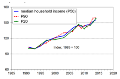
New Zealand has some problems with low productivity and consequently lower wage growth than we'd like, but growth in household incomes is broadly shared. Here's household income growth since 1990. The tracks for the 20th percentile, the median, and the 90th percentile are identical. Some blips along the way where one outpaces the other for a bit, but they start and end at the same point.
And the data cuts strongly against this kind of read on things:
The growing economy has seen increasing household incomes across the board. This isn't some "only the rich benefited" thing. On child poverty, I'm going to give a great big blockquote from Perry's latest report.Paul Goldsmith just said growing the economy would address child poverty but economy and poverty have both grown significantly since 1990.— Jan Logie (@janlogie) September 8, 2016
Housing costs and the longer-run trends in child poverty (1982 to 2007, 2007 to 2014)
• The BHC 50% CV-07 anchored line rate was lower in 2015 than what it was in the 1980s, around 10%, down from around 20% (see chart below), and the BHC moving line rates were around the same in 2015 as in the 1980s (see Figures F.3 and F.4 on the following pages).
• The AHC long-run trends are quite different: the AHC 50% CV-07 rate was still just a little above what it was in the 1980s, and the moving line rate in 2015 was much higher than in the 1980s.
• The graph below shows the different trends for BHC and AHC anchored line measures respectively.
• A key factor in explaining the longer-term differences between AHC and BHC rates is that housing costs in 2007 on average made up a higher proportion of household expenditure for low-income households than they did in the 1980s. For example, in 1988 16% of households in the bottom quintile lived in households that spent more than 30% of their income on housing. In 2007 there were 38%, after peaking at 48% in 1994. 43% in 2015.What we've got here, between those two graphs, isn't some "Oh, the gains from growth only go to rich people and leave people behind" story. It's largely a housing cost story. Low income rates for children are well down if we look at before housing cost incomes, but flat at a higher level than the mid-80s on an after-housing-cost measure.
• Both the income-related rental policies introduced in 2000 for those in HNZC houses and changes to the Accommodation Supplement (AS) settings in the mid 2000s helped to reduce net housing expenditure for some low-income households compared to what it would have been. This support contributed to the reductions in child poverty as measured on an AHC approach from 2001 to 2007.
• The policy settings for the AS have remained unchanged since 2005.
Now Perry's AHC and BHC table above uses a fixed-line low-income measure: they anchor things based on a prior year's income, but inflation adjusted. They take a prior year's low-income threshold, set as a fraction of that year's median income, then just inflation adjust that number for every subsequent year. So if current incomes are above a prior year's inflation-adjusted low income threshold, then that counts to the good side.
But you get a similarly large gap between AHC and BHC figures if you use a relative measure instead. More tellingly, the fraction of low-income people with very high housing expenditures relative to incomes has increased a fair bit despite the household income growth in the first chart.
Misdiagnosing the problem means you are going to screw up when trying to fix it with policy.
Time to get moving on housing.


No comments:
Post a Comment