
Keith Ng's 'mythbusting' around net taxpaying annoyed me enough that I started digging around for more of the literature on this stuff.
Keith argued that it's a myth that 40% of households pay no net taxes. While he's right that the commonly cited measure just focuses on income taxes paid versus cash transfers received, it isn't like correcting for that shows the system is less progressive or relies less heavily on the top deciles' tax contribution. When Aziz et al had a look, they found this:
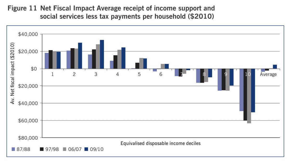
The figure shows the cost of transfers and services provided to households in each income decile, net of the taxes paid by households in that decile. It includes all taxes, even GST. And when you look at it that way, the bottom four deciles receive substantial transfers, the middle three deciles net out close(ish) to even, and the top three deciles pay rather more in tax than the value of the services they receive. Or, put another way, the bottom six deciles receive more in transfers and services than they pay in tax, the seventh decile is tiny net tax contributor, and the top deciles contribute substantially.
That should have been common knowledge among folks dealing with data, inequality, and tax. We even included the graph in our report on inequality.
What we didn't include, and I only recently had pointed to me, was the life-cycle and gender effect. Life cycle of course matters: government spends far more on kids than it receives in taxes from kids, and same for the elderly. Much of tax and transfer policy handles life-cycle income smoothing that would otherwise be generally handled by households on their own.
But I hadn't known the size of the gender gap. There had to be one, since men's earnings are higher than women's earnings; women live longer and then collect superannuation over a longer period; and, health care costs are higher for women. Even still, I was surprised. I hadn't known about the gender gap in education costs, for example.
Here's Aziz, Gemmel and Laws.

Regions above the $0 line x-axis are cohorts that, on average, are paying more in tax than they are receiving in transfers and in services (valued at cost). They write:
The data illustrated in the figure suggest that, on average, males start having a positive net fiscal impact—per capita tax revenue exceeds the (allocated) expenditure they receive—in their early 20s. Women, on average, do not pass this “break even” point until their mid-40s. This is due to a combination of lower workforce participation, higher health and education spending, higher income support, and lower direct and indirect taxation.If we consider only the age patterning, this looks like what households and individuals would be doing for themselves absent the state. You consume less than you earn during your prime earning years in order to provide transfers to your children and to save for your retirement.
A possible causal link may lie behind the high value of per capita education expenditure observed for women aged 30–44 and the lagged increase in per capita market income and direct tax for females in the 45–49 year age group. One possible hypothesis is that retraining during child-rearing years that precedes re-entry to the labor market results in an increase in market income and consequently higher direct taxation. The net effect of decreased education expenditure and increased direct taxation increases the net fiscal contribution of women in the 45–49 year old age group.
There's a similar aspect to the gender patterning where it is more common for males to be the primary earner. In households with a male primary earner and a female who takes a longer period out of work or in part-time work to be able to spend time in the home, you'd see males consuming less than they earn in the market and females consuming more than their market earnings. Were there no government-provided healthcare, taxes would be lower and families would purchase their own health insurance - which would have a similar 'net contribution' breakdown were anyone so daft as to try to produce that figure within a household.
This side of things didn't come in at all for the piece I wrote for the Dom Post on it, as it's largely irrelevant to the argument about household-level net tax contributions. But it's interesting and I hadn't known it before.
Thanks to John Creedy for the pointer.
Also: Fairfax produced this very nice infographic version of the Aziz et al figure. Excellent!
No comments:
Post a Comment