Showing posts with label Oxfam. Show all posts

Thursday, 27 October 2022

Oxfam misrepresenting inequality, again

The simplest explanation is probably the correct one. Oxfam writes dodgy reports on inequality because it works. Dodgy reports yield sensationalistic headlines, which drive donations to Oxfam.

You may remember Oxfam for annual dodgy reports on wealth inequality that typically try to tally up how many billion people have net wealth of less than a top handful of people. As Tim Harford pointed out years ago, his friend's daughter, who just received her first fifty-cent piece, had higher net wealth than about two billion people who have negative or no net wealth. Anyone finishing university with student debt, and who hasn't been gifted a pile of wealth by their parents, will be listed as having less net worth than a subsistence farmer in whatever most-destitute place you want to pick. Why? None of the figures count the value of the degree. It's all nonsense. 

Noah Smith fisked it over at Bloomberg in 2019; I've had a running series on these things too. Oxfam's numbers are designed to mislead. 

And journalists keep getting suckered by them. How can Oxfam help but be a bunch of humbugs when so many people want to believe things that are not true? Tom Hunt turned Oxfam's 2019 numbers into a front page story in the Dom, without any thinking through whether the numbers make any sense. It was quickly apparent that the main action for NZ was in currency movements, and that Oxfam's source, the Credit Suisse report, showed declining wealth inequality in NZ in any case.

But zero NZ journalists bother to check. Because it's Oxfam right? Don't they do good things abroad? Why would they lie, consistently, about the statistics?  

Earlier this year, Oxfam put up another one claiming huge increases in global poverty. Noah Smith went through it fairly comprehensively. Bottom line, Oxfam was just inventing huge numbers. And then Noah reminded everybody that "Oxfam is a serial repeat offender of dodgy statistics". 

So. When I saw a Newshub headline on a new Oxfam report claiming New Zealand's tax system is ranked 136th in the world in reducing inequality, I groaned. Not again. I hoped that nobody else was going to pick it up. The number was surely so obviously stupid that nobody other than Newshub might run with it. 

But then the Herald ran it. And the interview kept conflating wealth inequality and income inequality and making weird claims about the need for a wealth tax when that wouldn't even move the Oxfam measure, which only counts income, consumption, and company tax. 

So I had to go through it. 

You can read it at Newsroom. The data for it is here - the Google sheet pastes in the Oxfam tables, the OECD tables, then runs the comparative rankings. 

The points should be obvious to readers here:

  • Looking at any tax in isolation is a mistake; Oxfam complaining about GST being regressive is 1) wrong; 2) stupid because it's part of a progressive tax system. 
  • Looking at tax in isolation of transfers is even stupider. Imagine two countries. One runs fifty different income tax schedules depending on your household circumstances. The other runs one income tax schedule and then transfer programmes that depend on your household circumstances. You can design the two to yield identical results. But if you rank countries by tax system on its own, you'll wind up saying stupid things. 
  • The OECD data has NZ middling of 37 countries when assessed on tax and transfer. We start with low(ish) market income inequality and we wind up with middling after-tax-and-transfer income inequality. Take the difference as a percentage and NZ's tax and transfer system is 18th of 27. Middling. Like should be obvious to anybody who's ever looked at this freaking data. 
  • Any ranking of the inequality-reducing powers of tax systems that puts the US ahead of Sweden, and Costa Rica ahead of either us or the Swedes - how can you believe anything in the report if you see that? What's wrong with you? In the OECD data, Costa Rica starts with the highest market inequality among OECD-ranked countries, and still has the highest income inequality after tax and transfer, and has the system that does the least to reduce income inequality regardless of whether you measure it as a Gini-point difference or as a percentage reduction in the initial Gini measure. And Oxfam had Costa Rica ranked more than a hundred places above New Zealand. Even if you don't know anything about Costa Rica - how could you miss that they've ranked the US ahead of Sweden? Don't American and Kiwi social democrats constantly yearn to be more like Sweden? Think about it for half a second. 
Oxfam reports are like those email scams that put in deliberate typos and grammatical errors so that only the most credulous people believe them, so they don't have to waste time with people who'll wise up part-way through. 

But then I have to waste time going through them, because people still for whatever reason still trust newspapers.

Maybe the coming "let's ban disinformation" thing will ban Oxfam reports so I won't have to do this anymore. 

Friday, 25 October 2019

Setting the marker for January - the wealth report

Every October, Credit Suisse puts out its report on global wealth. It's not perfect, but it's a decent best guess about global wealth and its distribution.

And every January, Oxfam comes out with a The Sky Is Falling And Inequality Is Terrible gloss on the Credit Suisse figures. If you were teaching a How To Lie With Statistics course, the Oxfam reports would provide excellent fodder.

So, a few highlights from the Credit Suisse report, so we don't forget them come January when the Oxfam report comes out.

The report is here.

First up, New Zealand's place in the global wealth inequality figures.


(And here's a static version in case the interactive doesn't work)


There are 172 countries with a Gini coefficient on wealth. New Zealand's Gini (in red) is the 37th lowest.

Among the countries with more wealth inequality than New Zealand, in order starting with countries closest to us: Portugal, Iceland, Spain, France, Switzerland, Canada, Austria, Finland, Ireland, Norway, Denmark, the US, Sweden and the Netherlands.

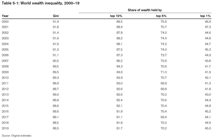
Global wealth inequality has been dropping, more or less, since 2000.


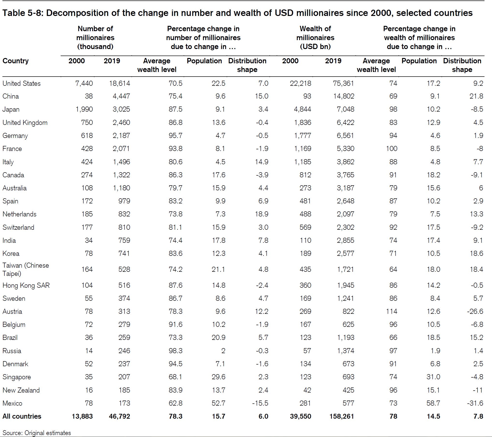
And they also decompose changes in the number and wealth of millionaires. You can get more and wealthier millionaires if all incomes rise, if population increases, or if the shape of the underlying distribution changes to favour millionaires. Here we see that since 2000, changes in the shape of the distribution have resulted in our millionaires having less wealth than otherwise. 


And this year's Gini is down on last year's as well. 

If I were Oxfam and wanted to put up a scare story about inequality out of this, but one grounded in the numbers rather than just being fantasy, I'd look hard at how much of the measured reduction in inequality is driven by changes in housing wealth. Recall that housing is a substantial part of the wealth portfolio of those in the middle wealth deciles, and that increased houses prices do more to boost wealth in the middle than at the top. But there can be strong disparities between homeowners and non-owners. That's a story of anticompetitive housing regulation set by councils under incentives set by central government rather than one about evil rich people and the need for income redistribution. 

Monday, 21 January 2019

Oxfam - again

Every year, Credit Suisse puts out its October report on global wealth.

Every January, Oxfam releases a gloss on that report. Every time, the policy recommendation is the same - tax wealth.

The Dom Post's Tom Hunt went for Oxfam's bait this time round. It was a bit frustrating because Oxfam didn't have its report up on its website until this afternoon; Hunt's story was on the Dom's front page first thing in the morning. Hunt's headline: Rich richer, poor poorer (at least on the print edition).

The only mention of New Zealand in the Oxfam report is in a note that Oxfam NZ is a local partner in the report. But their data comes from two sources. They use Forbes' rich list (why not NBR's if they actually want anything local?), and Credit Suisse's October report.

What do we find in the October Credit Suisse report? Currency movements. Total NZ wealth dropped from $1,037 billion USD last year to $1,010 billion USD this year - in current exchange rate terms. At constant exchange rates, wealth instead increased from $995 billion to $1,053 billion.

Recall that middle-wealth households have disproportionate amounts of wealth tied up in their houses. If the exchange rate moves, their reported wealth in USD terms will drop. Recall that richer households have more substantial financial assets (relative to their housing assets) and will be diversified. They're hit less by exchange rate changes. So when the exchange rate drops, it looks like richer households are hit less than poorer households. The report notes a -7.2% change in the value of the NZ dollar against the US dollar.

What else can we quickly see in the Credit Suisse report? The Gini coefficient for New Zealand, this year, is 70.8. Last year it was 72.3. That's the opposite of Hunt's headline. I think that headline came from Forbes' figures on the two richest people in New Zealand rather than from the more comprehensive Gini stat. A headline coming out of the Credit Suisse report could easily have been "Wealth Inequality Drops". But that isn't the story Oxfam wants to tell, and nobody at the Dom seems to have checked the source data.

I can't be bothered turning Credit Suisse's PDF into a Google Sheet this go-round; the drop is equivalent (against last year's data) to moving six places in last year's ordinal rankings.

What else is in there?

Since 2000, the start year of their data, median wealth per adult increased from $26,933 to $101,718 last year to $98,613 this year; mean wealth per adult went from $71,632 to $300,988 last year to $289,798 this year. So the median is 3.7 times higher than it was in 2000 and the mean is 2.9 times higher than it was at the start of the period. Both mean and median wealth dropped from last year. So another headline could have been "New Zealand is poorer (but it's mostly currency movements)."  Note that these numbers vary substantially from last year's go round - the base figures are different than they then were. I assume that they've updated exchange rates but I don't really know.

New Zealand now has 1,725,000 adults with more than $100,000 USD in wealth, and 155,000 with more than $1,000,000 USD in wealth. Again, owning a house in Auckland mortgage-free gets you pretty close to that million dollar mark. But twenty thousand fewer Kiwis make the cut for the global top 1% - we're on the list of the world's biggest losers in that category. So another headline could have been "Far fewer Kiwis among the global elite - and wealth inequality is down too."

Pretty much the whole country is in the world's top 3 wealth deciles - or at least the number of Kiwis falling into the lower deciles rounds down to zero when calculating our share of those global wealth deciles. We have 0.4% of the world's top 10%, top 5%, and top 1%. We're 0.2% of the global 9th decile, 0.1% of the global 8th decile, and rounding error below that. So another headline "All things considered, we're pretty wealthy."

Anyway, go look at the Credit Suisse report for yourself. Journalists should be a bit less credulous about Oxfam's reporting on the figures, especially where Oxfam pulls this exact same stunt every year. Hunt paints a picture of wealthy Kiwis getting richer and poor Kiwis getting poorer. The Credit Suisse figures instead show we all got poorer (and wealth inequality dropped), but that it's mostly changes in exchange rates.

I like my headlines above better than the one the Dom picked for Hunt.

Previously:


Wednesday, 24 January 2018

Wealth inequality and Oxfam, again

Every year, Credit Suisse puts out its new databook measuring global wealth. And, like clockwork, Oxfam follows it up a few months later with calls to liquidate the wealthy.

Here follow some fun facts from the Credit Suisse report that provides the data that forms the basis for the Oxfam stuff.

At the end of 2000, New Zealand had 0.1 percent of the world's adults and 0.2% of the world's wealth. Mean wealth per Kiwi adult was USD $67,275; median Kiwi wealth was $30,078. By comparison, the global median wealth per adult in 2000 was $1,867.

By mid-2017, New Zealand still had only 0.1% of the world's adults but had managed to scrounge up 0.4% of the world's wealth: wealth per NZ adult rose to USD $337,441 and median wealth per adult rose to $147,593. Meanwhile, global median wealth per adult rose to $3,582.

Mean Kiwi wealth is five times higher than it was in 2000; median Kiwi wealth is 4.9 times higher. Global average wealth grew 1.8 times over the period and global median wealth grew 1.9 times.

Pretty clearly, Kiwis are doing something to steal wealth from the rest of the world. Because that's the only plausible reason that one person's wealth grows more quickly than another's, right? If Kiwis' wealth had kept pace with international norms, which are presumably fair, New Zealand's median wealth would be $57,750, not $147,593. The median Kiwi has almost $90,000 that should rightly have been shared around to poorer people internationally. And if mean wealth had tracked international norms, average wealth per adult would be about $120,000, not $337,000. Tracked across the 3.4 million adults in New Zealand, that's $735 billion dollars of unfair Kiwi wealth. The couple billionaires that are the focus of Oxfam's Five-Minutes Hate (NZ edition) have about eleven billion between them.

Okay, enough snark, though it is fun. Back to Credit Suisse.

NZ enjoyed the world's fourth highest percentage increase in total household wealth from 2016 to 2017, and the sixth highest in per-adult terms. In total, NZ households are $132 billion dollars richer than they were last year.

As for distribution, NZ's wealth gini is reported at 72.3. The median country's gini is 71 and the mean country's gini is 69.8. If you pull the pdf into an Excel table and sort by wealth gini... actually no. Here it is in a Google Sheet so you can check for yourself.

Anyway, New Zealand winds up being the 80th most unequal country in the world, or the 92nd most equal - on the Gini measure. Pretty middling. The world's most unequal country is Venezuela. After that, and in order, it's Kazakhstan, Egypt, Namibia, Ukraine, South Africa, United Arab Emirates, Bahrain, the US, the Bahamas, Hong Kong, and Thailand. Sweden is the 17th most unequal country on this measure. Germany is 42nd, followed by China at 43th. You have to go past Canada at 71st and the UK at 72nd and the Netherlands at 75th before you get to New Zealand at 80th most unequal.

And Myanmar, where 99.3% of the population has less than $10,000 USD in wealth, is the most equal, with a Gini of only 31.

The plot below is surely too small to read, but the hover-overs might work. If not, hit the link to the Google Sheet above.


New Zealand is a wealthy place. 1,971,000 adults have over USD $100,000 in wealth. Forget per capita stuff: that puts us, in sheer numbers, as having the 26th highest number of people with wealth over $100,000. We also have 201,000 people with more than USD $1,000,000 in wealth - a lot of Auckland houses, if owned mortgage-free, would put you in that tier. 

The wealth decile tables are even more interesting. They sort the world by wealth, split it into deciles. Then they report what fraction of the world's (say) bottom decile live in each country. New Zealand has only a tiny fraction of the world's population, but we have 0.1% of those living in the global bottom decile. Why? You can borrow money for education in New Zealand, resulting in negative measured wealth, making you less wealthy, on paper, than someone living debt free on $1.90 per day - and less wealthy than any newborn. At Table 6-5, we see that New Zealand's bottom decile's share of New Zealand's wealth is negative.

At Table 6-1, we find that New Zealand has 2.1 million people who are in the global Top 10%. And remember that their data's on New Zealand's 3.4 million adults.* So the median adult in New Zealand (again - half have more, half have less) is easily in the global Top 10% by wealth. And 301,000 are also in the Global Top 1%.

If we look at the fraction of wealth held by the top 1% in New Zealand, it shows up at 23.8%. Is that high? They provide that data for a set of 39 countries. Among that set, the fraction of wealth held by New Zealand's top 1% is the world's ninth lowest. The top 1% in New Zealand have a smaller fraction of national wealth than the top 1% in the UK, Spain, Canada, Greece, Romania, Korea, Norway, Finland, Germany, Ireland, Denmark, Singapore, Israel, the US, Poland, South Africa, Sweden, India and more. Did I say Sweden? Yes. Sweden's top 1% own 41.9% of Sweden's wealth.

If you look at the top 5% instead, New Zealand's got the 9th lowest again. If you shift to the share owned by the top 10%, New Zealand's 11th lowest out of 39; Sweden is second highest. 

Takeaways:

  • Mean and median wealth in NZ, as reported in the Credit Suisse data, have increased considerably since 2000. One measure of inequality is the mean/median ratio. If the average increases by a lot more than the median, that suggests that the gains are disproportionately at the top. Here, it's almost rounding error between the two. The mean is 5 times higher than it was in 2000; the median is 4.9 times higher. It would be... odd... to look at that and conclude that all the gains are for the rich. If that were true, growth in median wealth would have been much smaller than the growth in average wealth. 
  • If you want to rail against Top 10%ers, well, the median Kiwi adult is in the global top 10%. 
  • New Zealand is very middle-of-the-road when it comes to global wealth inequality as measured by Gini. 
  • If you want to look instead at the proportion of wealth held by the top 1%, top 5%, or top 10%, New Zealand's rich have much smaller fractions of national wealth than do the rich in Canada, Finland, Norway, Germany, Denmark, and Sweden. Among the 39 countries assessed, New Zealand's rich have between the 9th and 11th smallest wealth shares. 
I suppose I'm glad that global poverty has declined so much that charities that used to spend their time trying to help the global poor now can spend their time doing this stuff instead. 

Oh, and do note all the caveats from previous iterations on this stuff (links below). A pile of what's going on for wealth measures winds up reflecting US dollar exchange rates. That won't affect wealth shares within countries but will affect measures of global inequality and measures like "This richest billionaire has as much wealth as the world's howevermany hundred million poorest people, including a pile of people with net debt due to student loans in rich countries and another pile of people outside of the US whose measured wealth dropped because the US exchange rate went up. That'll also affect the number of Kiwis making any year's iteration of the global Top Whatever Percent. 

Previously:
* I'm pretty sure that they're using an adults denominator here rather than total population. But I can't guarantee it. If they're using total population, then the median Kiwi is just shy of the global top 10%.